|
|
Post by Quikefire on Feb 12, 2005 1:30:49 GMT -5
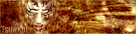
 i made this when i was down / hopeful / bored |
|
|
|
Post by BlackCoven on Feb 12, 2005 1:47:25 GMT -5
The text font and style are pretty bad, and I am not sure about the contrasting yellow either. If it was about 1/2 inch shorter in height and a better font, it would be pretty nice I think....
Taller banners are harder to design I think..
|
|
gokusrage
Super Saiyan
 LIFE IS A MYSTERY.... *GOLDENBOY*
Posts: 218
|
Post by gokusrage on Feb 12, 2005 2:02:33 GMT -5
looking good, looking good.. I like it.. the font needs to be a different color I think... and its hard to see the pic all the way on the left.. but since this is like what, your 4th banner.. man looking good, looking good..
|
|