|
|
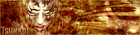
Post by Derek on Apr 9, 2005 20:28:28 GMT -5
Positive/Negative Feedback Welcomed...  |
|
|
|
Post by rjxsapri® on Apr 9, 2005 21:44:52 GMT -5
Really great...but u use that same style a lot...  |
|
|
|
Post by Derek on Apr 9, 2005 21:58:31 GMT -5
And what style is that?
|
|
|
|
Post by YoshikiRose on Apr 9, 2005 22:04:51 GMT -5
All of your work looks very intense. I like it. So much in fact, I may let you do my Közi sig...  |
|
|
|
Post by Derek on Apr 9, 2005 22:11:22 GMT -5
All of your work looks very intense. I like it. So much in fact, I may let you do my Közi sig... Thanks..And if u want me to do u a sig. Get at me on AIM or MSN. Ill make a nice one for you..ok? |
|
|
|
Post by rjxsapri® on Apr 9, 2005 23:34:18 GMT -5
I mean like, just do a brushed background and put one picture on the side...it looks awesome, but I'm just saying that a lot of them look somewhat similar... |
|
|
|
Post by Derek on Apr 9, 2005 23:39:09 GMT -5
I mean like, just do a brushed background and put one picture on the side...it looks awesome, but I'm just saying that a lot of them look somewhat similar... Hm..Never Had any complaints before. Thats what i do grunge/Abstract..never cared for any other ways. Plus more than one pic looks crowded, IMO. And they never look similar, all my backgrounds are diff. And I will switch up the picture location from time to time. Oh well..not trying to be an ass either. |
|
|
|
Post by rjxsapri® on Apr 10, 2005 0:12:27 GMT -5
I'm not complaining...just saying that most people I've seen try many different things every time...
And more than one pic shouldn't look crowded if used right...(not saying I know how to use them right)...Look at Rider's or BlackCoven's sigs for example...but I really like ur style, and of course the background will always be different, but it's just that the layout is always basically the same. But maybe I haven't seen enough of your sigs...
Still, the one's I've seen are great...awesome, perfect...just very similar.
|
|
|
|
Post by BlackCoven on Apr 10, 2005 1:34:23 GMT -5
Hm..Never Had any complaints before. Thats what i do grunge/Abstract..never cared for any other ways. Plus more than one pic looks crowded, IMO. And they never look similar, all my backgrounds are diff. And I will switch up the picture location from time to time. Oh well..not trying to be an ass either. I noticed your stuff is often very contrasty which looks good and enables for a more blended look. The brushing effect looks great though, but I often find it repetative also. For this particular sig, I don't care for the pic used all that much or the text shadow above the main text. I looks good none the less. P.s. I make terrible sigs all the time so I hope you don't think I am sitting on a petistal by any means, hell, your probably much better at this then I. |
|
|
|
Post by SnakeFire on Apr 10, 2005 8:37:43 GMT -5
I like the brushing in the background. It is really cool. You always do good with your backgrounds. I don't like the reflection of the text. And I can understand where you're getting at with the crowding of one too many pictures. But, if it's a big sig (like mine, lol) than two pictures wouldn't crowd as much. What I like, is a bright still picture (like the one in my sig) and than a faded picture with them doing something (fighting for example). I don't know- I'm weird... |
|
|
|
Post by rjxsapri® on Apr 10, 2005 16:04:55 GMT -5
It doesn't matter if it's a big sig or not...what matters is how you work with the pics, how you make them the right size, or place them in the background...I think it takes more creativity to use pics the right way than anything else... |
|
|
|
Post by Derek on Apr 10, 2005 16:17:37 GMT -5
Well Thanks For The Feedback Although I Wont Change The Way I Do My Sigs.. I Appreciate Your Thought's.
|
|